Twin Oaks Aikido - Logo & insignia design

Twin Oaks Aikido

Brand identity System & Strategy | Logo & Insignia Design | 2023

Shaped by airports and train stations ...

The Mission ...

Create a logo and school insignia that captures the essence of the dojo’s origin story, channels the flowing yet powerful nature of Aikido, embodies its deep-rooted philosophy and spirit, and honors the unwavering warrior spirit of the Aikidoka.

Background ...

Nestled within Houston's heart, Twin Oaks Aikido stands as a martial arts haven unlike any other. Fueled by an unwavering passion, its dedicated Aikidokas, a community rich of experienced black belts, have embraced the art as a lifelong journey. When the echoes of Covid led their former dojo to shutter its doors, a resilient spirit took root, guiding them to the sheltering embrace of Houston's scenic parks, where they've forged their sanctuary under the guardianship of the majestic wild oaks that grace the landscape.Thus, emerged Twin Oaks Aikido, a testament to their unyielding commitment and the enduring spirit of the art.

Design Concept and Approach ...

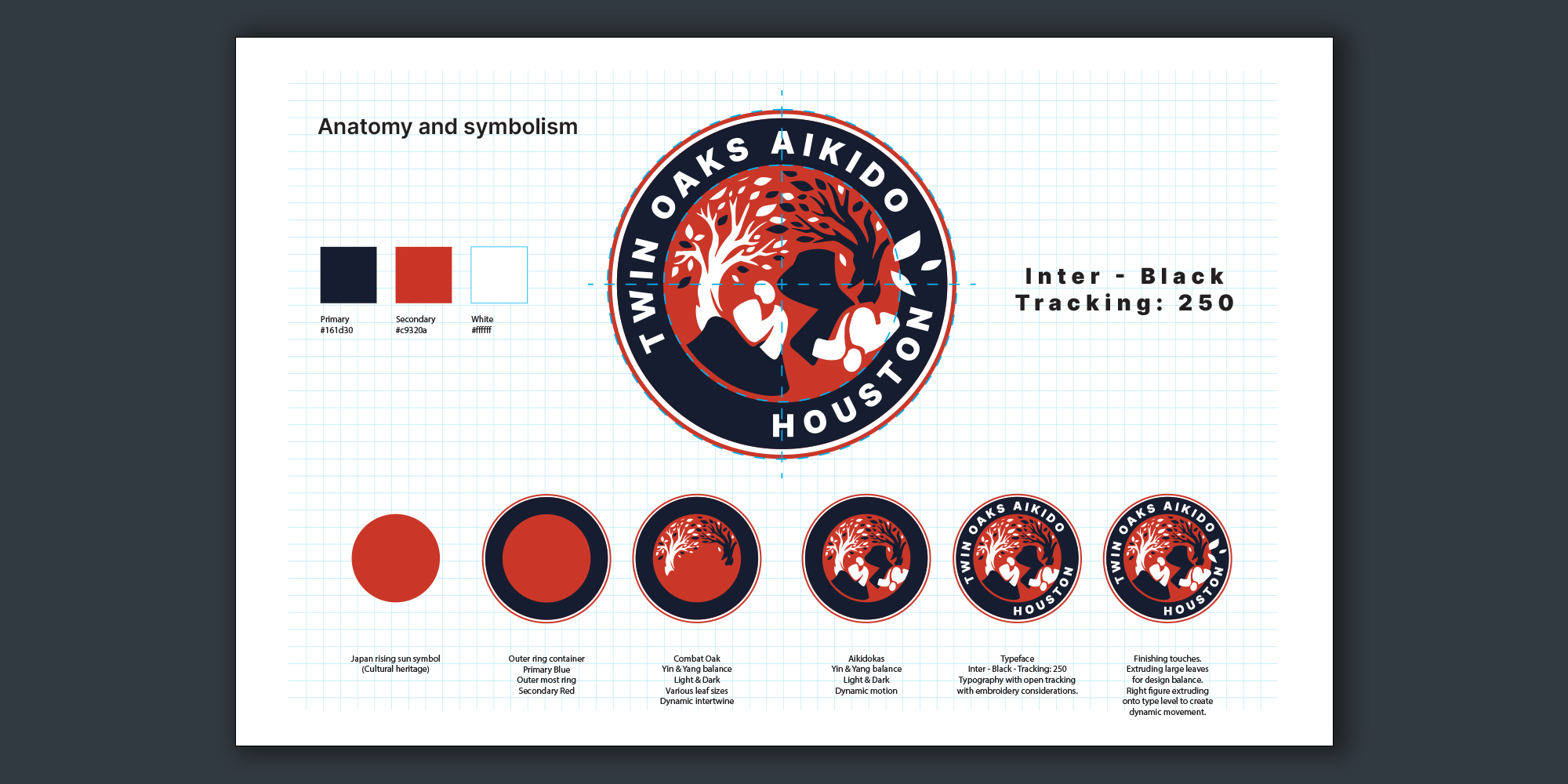
Being an Aikidoka myself, the connection to this passionate group was deeply personal, urging me to craft a brand identity for this nascent school that would resonate with its storied history and unwavering dedication. The logo, almost a manifestation of its own, materialized seamlessly. While we explored diverse design concepts intertwining oak tree elements like oak leaves, acorns, and Aikido symbols, the oak tree stood alone as the emblem of the school's legacy. Infused with dynamism and a nod to a signature Aikido technique, the Combat Oak insignia was born.

Phase 1 - Research ...

To kick off the design process, we focused on capturing the visual identity of the school. We explored what could symbolically represent both Twin Oaks Aikido and the essence of Aikido itself. In addition to a selection of traditional Aikido-related imagery, we also explored oak-inspired elements—such as the tree, acorn, and leaves—to tie back to the name “Twin Oaks.”

Twin Oaks Aikido - Design exploration. Sun, Enso circle, Tree, oak leaf and acorn, Japanese martial arts symbols

Phase 2 - Exploration ...

 Next, we combined them and tested with the team and students’ initial response to the combination of certain elements. The tree stood out.

Twin oaks Aikido - Design exploration. Combinations of Tree and sun, Enso circle, leaves, acorn, figures

Phase 3 - Refinement ...

Now the real fun started – Designing and gets the hands dirty. I looked at different illustration styles and viable combination of tree and the dynamic movement of human elements. An aikido signature move was a good candidate for exploration.

Twin Oaks Aikido - Insignia design exploration refinement.

Finishing up ...

Now the real fun started – Designing and gets the hands dirty.I looked at different illustration styles and viable combination of tree and the dynamic movement of human elements. An aikido signature move was a good candidate for exploration.

Twin Oaks Aikido - Insignia overview of design elementsTwin Oaks Aikido - Insignia break up of design elementsTwin Oaks Aikido - style guide

Merch n' Stuff ...

With versatility in mind, the final design was meticulously tailored to various applications, whether as an embroidered patch for the Gi uniforms, a monochromatic rendition for caps, or a screen-printable version for tees and other merchandise.

Baseball cap with Twin Oaks Aikido logo - front
Twin Oaks Aikido logo - black & white
Baseball cap with Twin Oaks Aikido typography - back
Twin Oaks Aikido insignia embroidery
Twin Oaks Aikido - t-shirt - back with logo
Aikido Yudansasha book with Twin Oaks Aikido stamp

Brand Identity & Creative Workshop ...

Like in many of my brand identity system undertakings, I immersed myself deeply in the origins of concepts to initiate the design journey. Grasping the purpose, the fundamental WHY, stands as a pivotal component of my exploratory procedure. This is closely followed by delineating the value proposition and the organizational vision. After several cycles of refining and engaging in a brand discovery workshop, we ultimately arrived at a visual design that garnered unanimous approval.

The collective exercise played a pivotal role, given the cohesion within this tightly-knit group. We meticulously crafted the school's mission and vision statements, pinpointed their value proposition, and honed the school's positioning statement, resulting in a robust brand strategy poised for future expansion.

We loved working with Ron.  He was able to coordinate a diverse group of people and help us to discern the elements that defines us. By the end of the visioning process we had core concepts that we have been using for the past year to stay true to the course we set. He created our logo that reflects these core concepts and recalled our origin story — it gets compliments from everyone who sees it.

Karen Vargas

Founder & Principal Instructor - Twin Oaks Aikido

Twin Oaks Aikido

Brand Strategy | Logo & Insignia Design | Merchandise | 2023
Twin Oaks Aikido of Houston, Texas

Nestled within Houston's heart, Twin Oaks Aikido stands as a martial arts haven unlike any other. Fueled by an unwavering passion, its dedicated Aikidokas, a community rich of experienced black belts, have embraced the art as a lifelong journey. When the echoes of Covid led their former dojo to shutter its doors, a resilient spirit took root, guiding them to the sheltering embrace of Houston's scenic parks, where they've forged their sanctuary under the guardianship of the majestic wild oaks that grace the landscape. Thus emerged Twin Oaks Aikido, a testament to their unyielding commitment and the enduring spirit of the art.

Design Concept

Being an Aikidoka myself, the connection to this passionate group was deeply personal, urging me to craft a brand identity for this nascent school that would resonate with its storied history and unwavering dedication. The logo, almost a manifestation of its own, materialized seamlessly. While we explored diverse design concepts intertwining oak tree elements like leaves, acorns, and Aikido symbols, the oak tree stood alone as the emblem of the school's legacy. Infused with dynamism and a nod to a signature Aikido technique, the Combat Oak insignia was born.

With versatility in mind, the final design was meticulously tailored to various applications, whether as an embroidered patch for the Gi uniforms, a monochromatic rendition for caps, or a screen-printable version for tees and other merchandise.

Brand Strategy & Workshop

Like in many of my branding undertakings, I immerse myself deeply in the origins of concepts to initiate the design journey. Grasping the purpose, the fundamental WHY, stands as a pivotal component of my exploratory procedure. This is closely followed by delineating the value proposition and the organizational vision. After several cycles of refining and engaging in a brand discovery workshop, we ultimately arrived at a visual design that garnered unanimous approval.

The collective exercise played a pivotal role, given the cohesion within this tightly-knit group. We meticulously crafted the school's mission and vision statements, pinpointed their value proposition, and honed the school's positioning statement, resulting in a robust brand strategy poised for future expansion.

Brands I've worked with

Bristol-Myers Squibb Company logoHalliburton Corporation logoAdobe Systems logoBaker Hughes Company logoSysco Corporation logoXrathus - Digital Collaboration Paltform